Type of Work
User Research
Wireframing
Prototyping
Usability Testing
Sector
Insurance
Team
Vipin
Date
Jan 2020
Overview
This project focused on redesigning the employee benefit enrollment dashboard to create a streamlined, user-friendly experience. The goal was to improve the overall usability, making it easier for employees to select and enroll in medical benefit plans. The new design provides an intuitive interface, a clear step-by-step process, and helpful tools to compare plans and complete the enrollment process smoothly.
Problem Statement
The current benefits dashboard presents significant usability challenges, making it difficult for employees to navigate and complete their enrollment process efficiently. Users experience confusion about where to begin and how to select a plan, with plan comparisons lacking clarity, which complicates decision-making. Additionally, the multi-step enrollment process is cumbersome, particularly when enrolling in rider plans or uploading necessary documents, often leaving users without proper guidance. Furthermore, the opt-out button is inefficient, causing frustration among employees who wish to decline enrollment but struggle to clearly indicate their choice. These issues collectively hinder a seamless and user-friendly experience.
Redesign Goals
- Create a clean and intuitive dashboard that is easy to navigate.
- Simplify the enrollment flow, especially for plans with multiple steps and rider options.
- Enable easy comparison of medical plans so employees can make informed decisions.
- Clarify the "enroll" and "opt-out" options to ensure users can clearly indicate their preferences.
Design Process
Dashboard Layout & Navigation
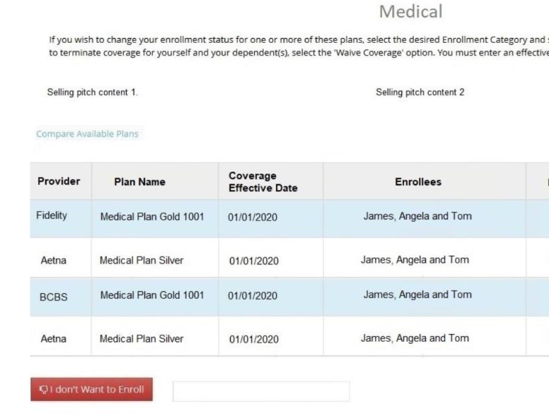
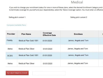
Old Design: The old layout did not make it clear where users needed to go to begin the enrollment process.
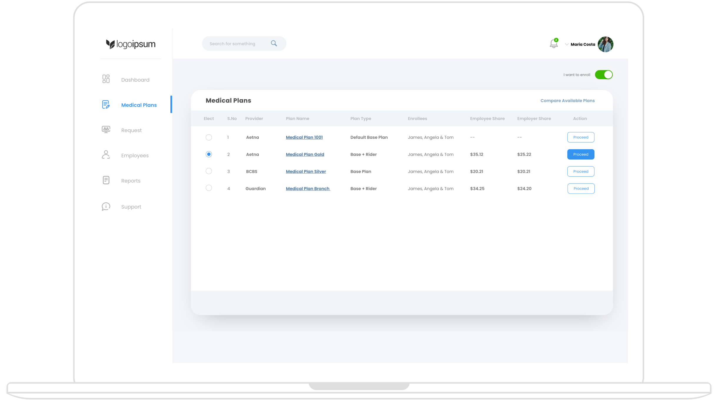
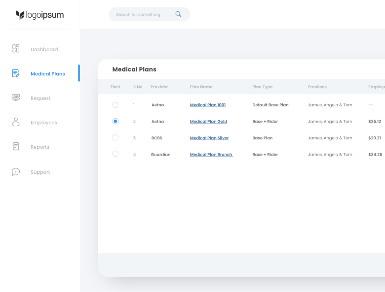
New design: The redesigned dashboard has a clean and intuitive layout, where employees, upon logging in, see a left navigation panel. From this panel, users can easily navigate to “Medical Plans,” which presents a list of available plans. This list includes essential details such as provider name, plan name, plan type, and enrollees, helping users quickly assess their options.
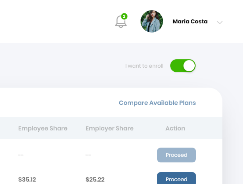
A toggle button at the top of the screen labeled "I want to enroll" is turned on by default. If employees wish to opt out, they can switch it off, which makes the process of opting out clear and accessible.
Plan Comparison Feature
Old Design: TUsers found it difficult to compare different plans side by side
New design: I introduced a plan comparison feature on top right the plan listing. This allows users to compare key attributes of different medical plans, making it easier to decide on the best option before proceeding with enrollment. and accessible.

Plan Selection and Enrollment Flow
Old Design: The enrollment process was not well-defined, and users struggled to navigate multi-step plans or handle document uploads.
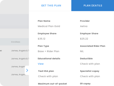
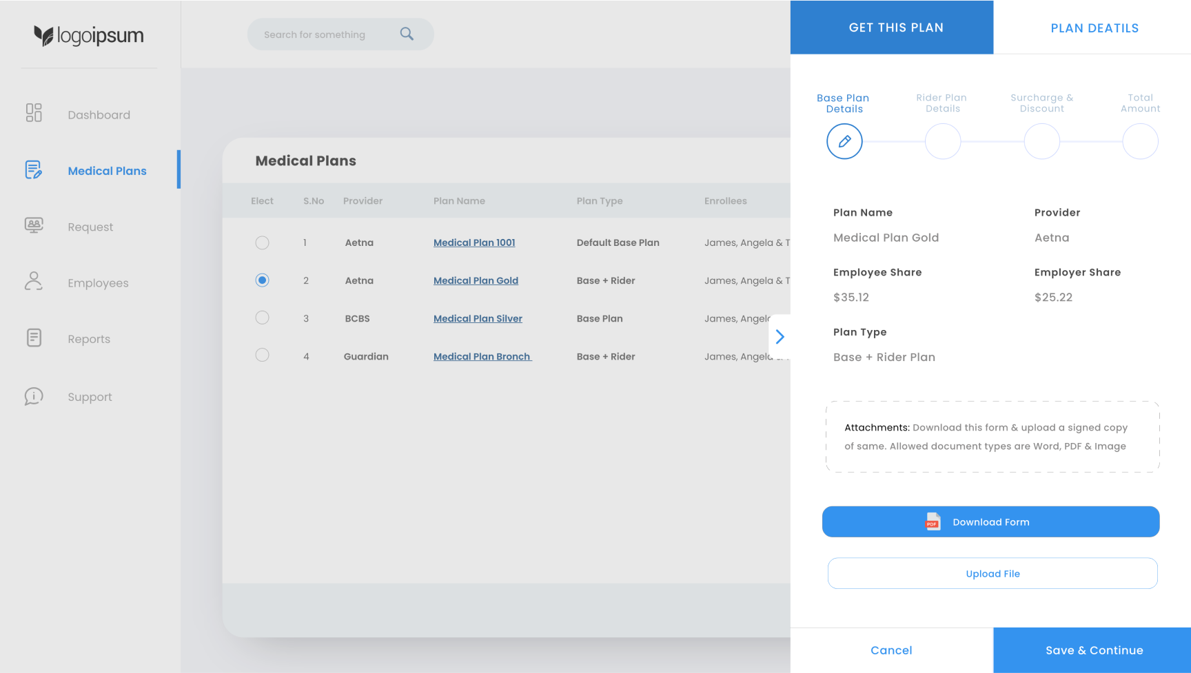
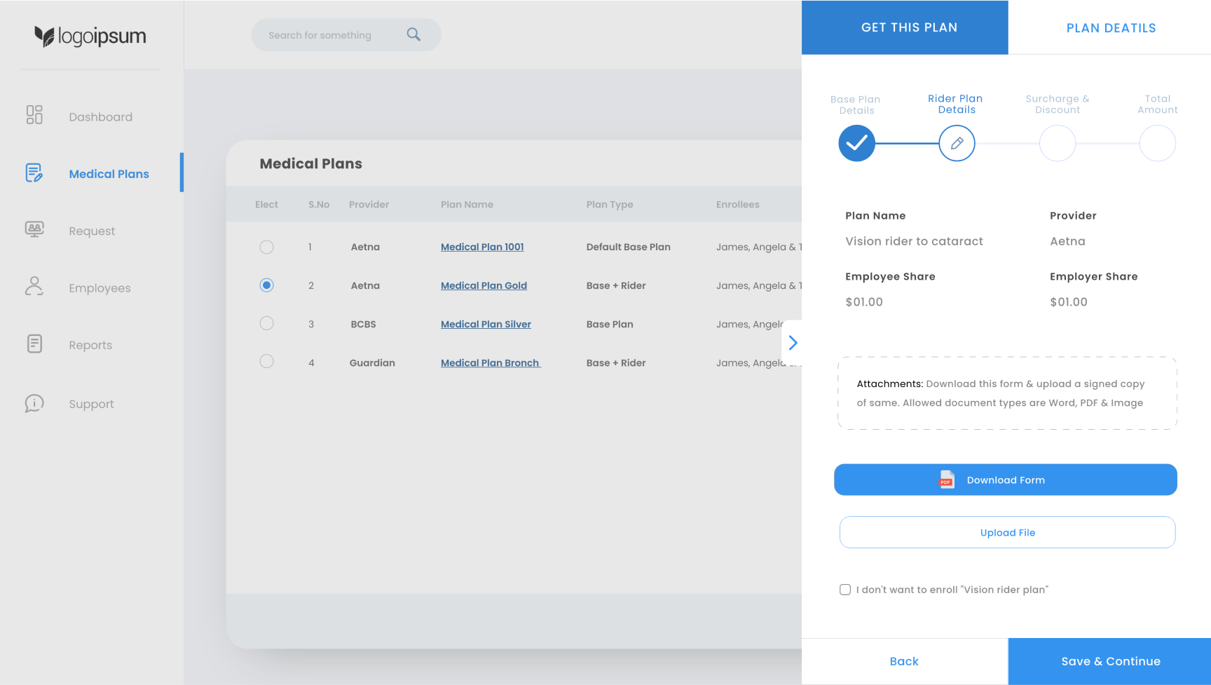
New design: The flow was redesigned to be clear and guided. After selecting a plan, employees click the "Proceed" button, which opens a side panel modal. This modal has two tabs:
- Plan Details Tab: Displays detailed information about the selected plan.
- Get This Plan Tab: Leads users to a simplified 3-step enrollment process, with a 4th step added if there is a rider plan involved.
Enrollment Process
Step 1
Employees review the base plan details. If the plan includes a rider, they will also see options to download the necessary forms. A button for uploading the signed copy of the form is provided to make the process seamless.
Step 2
If applicable, the next screen provides details about the rider plan. Employees can review the information and, once ready, click “Save & Continue.”
Step 3
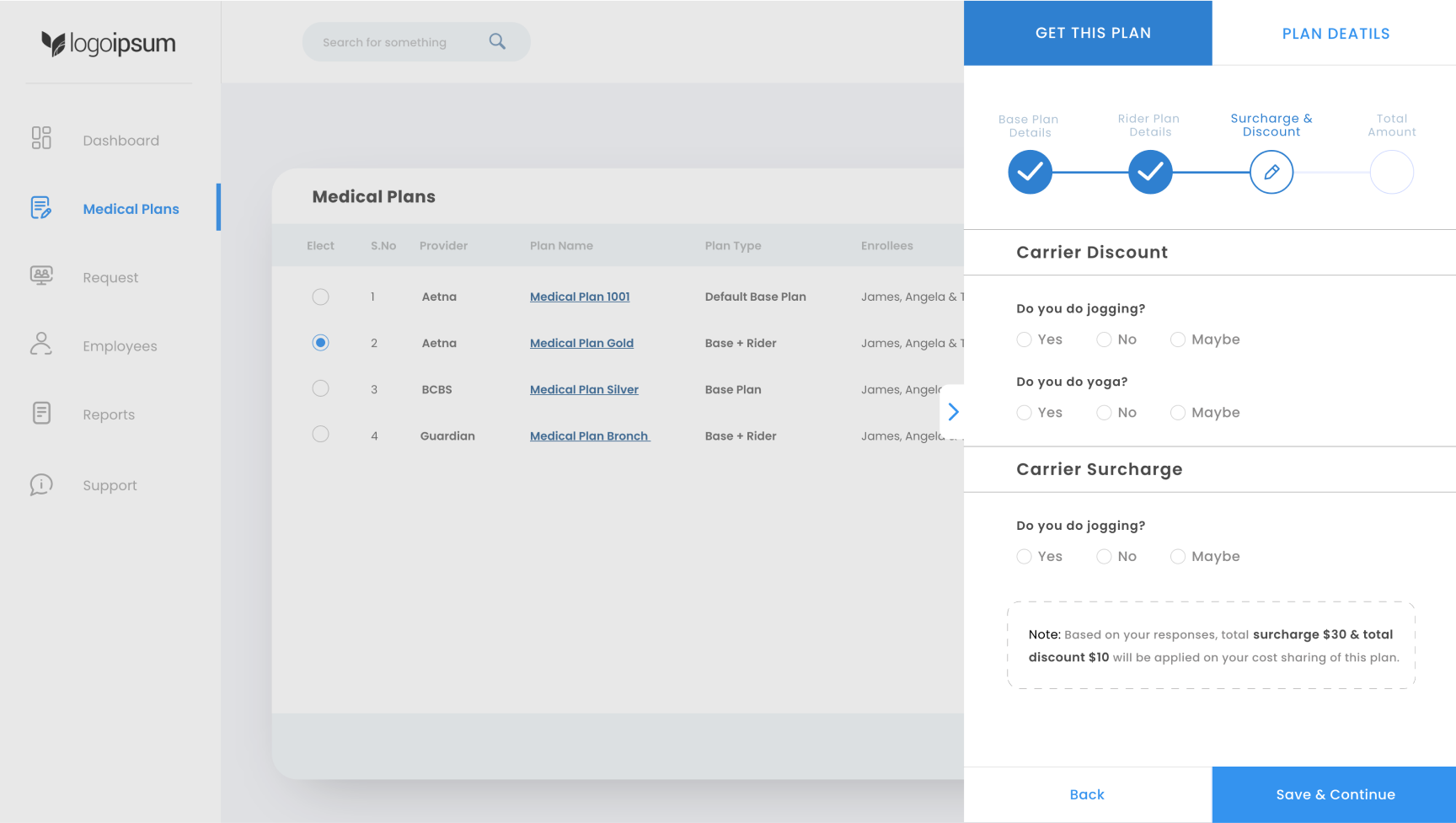
Employees are asked to answer a few questions related to discounts and surcharges based on carrier requirements. These questions are designed to be simple and easy to answer.
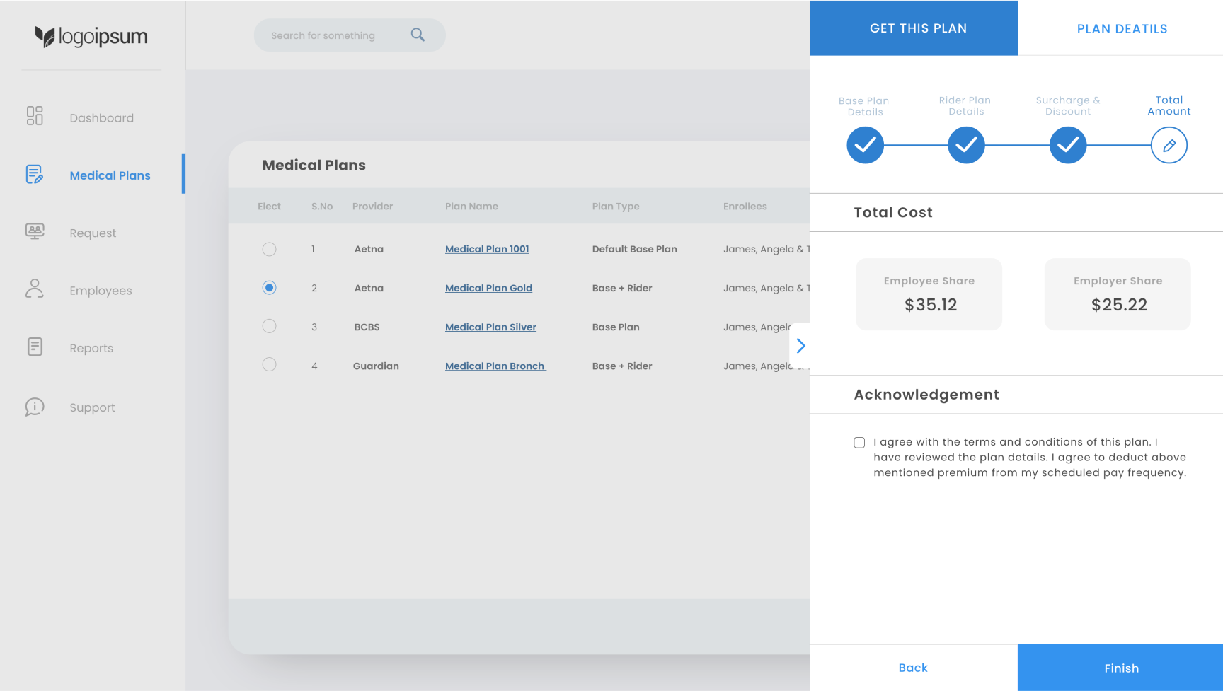
Final step
Employees see a summary of their total cost, including any applicable discounts or surcharges. After reviewing the cost breakdown, they can agree to the terms by checking a box and clicking “Finish” to complete the enrollment.
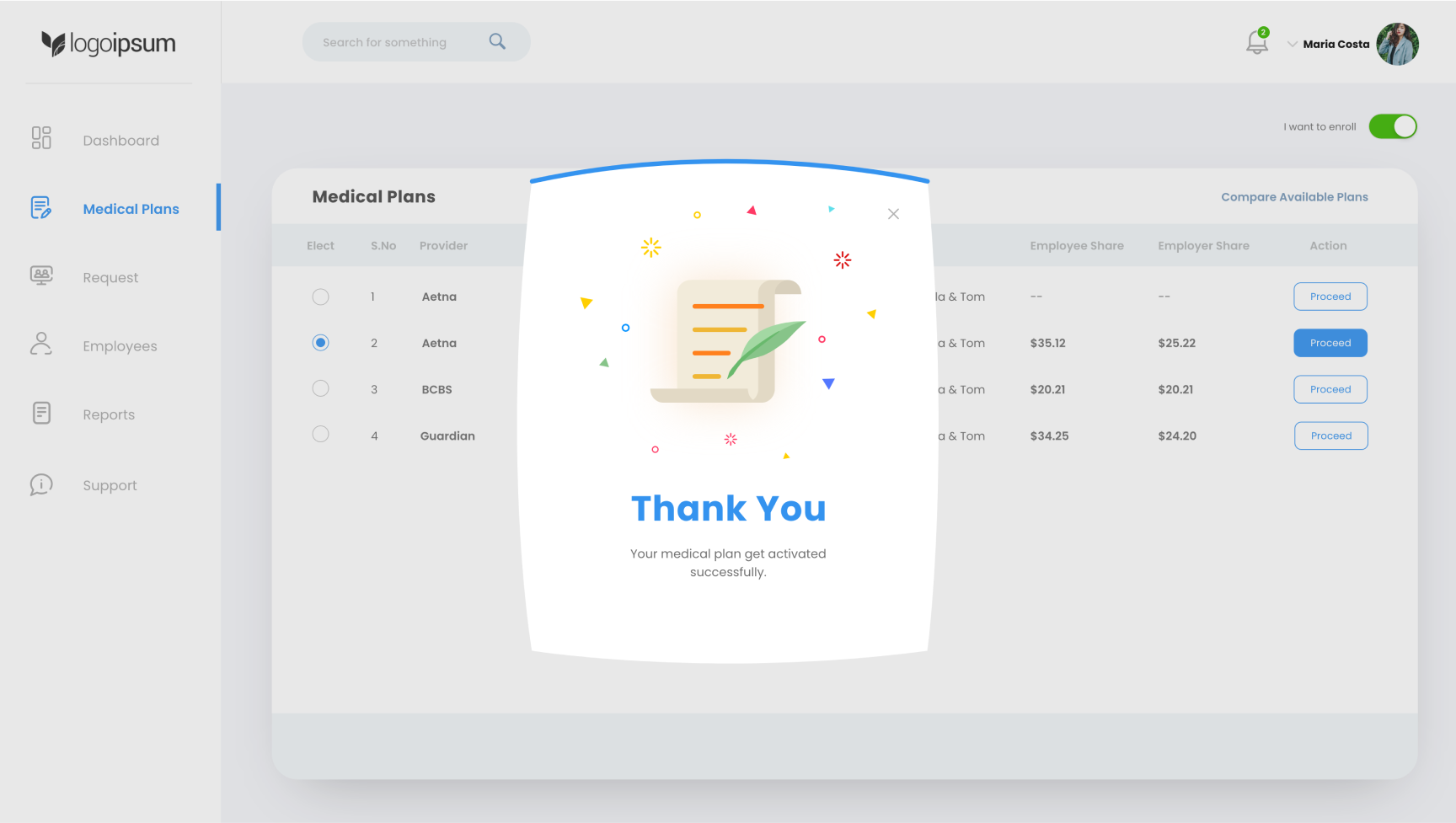
Success
The employee has successfully completed the plan selection process.
Key Features of the Redesign

- Clear Call to Action: The prominent toggle button allows users to quickly indicate if they wish to enroll or not.
- Side-by-Side Plan Comparison: The ability to compare medical plans helps users make informed decisions.
- Step-by-Step Enrollment Process: A guided process ensures users can easily move through the enrollment flow, whether they are selecting a base plan or a more complex plan with a rider.
- Streamlined Document Upload: Users can quickly download and upload necessary forms without leaving the current view.
- Discount and Surcharge Questions: Simplified questions related to carrier discounts and surcharges ensure transparency in costs.
Final Outcome

- Increased User Satisfaction: Employees found the redesigned dashboard more intuitive and easier to navigate, resulting in higher satisfaction scores.
- Reduced Completion Time: The step-by-step process, along with the streamlined document handling, reduced the time required to complete the enrollment process.
- Lower Drop-off Rates: The clarity in the opt-out toggle and the guided flow led to fewer users abandoning the enrollment process midway.